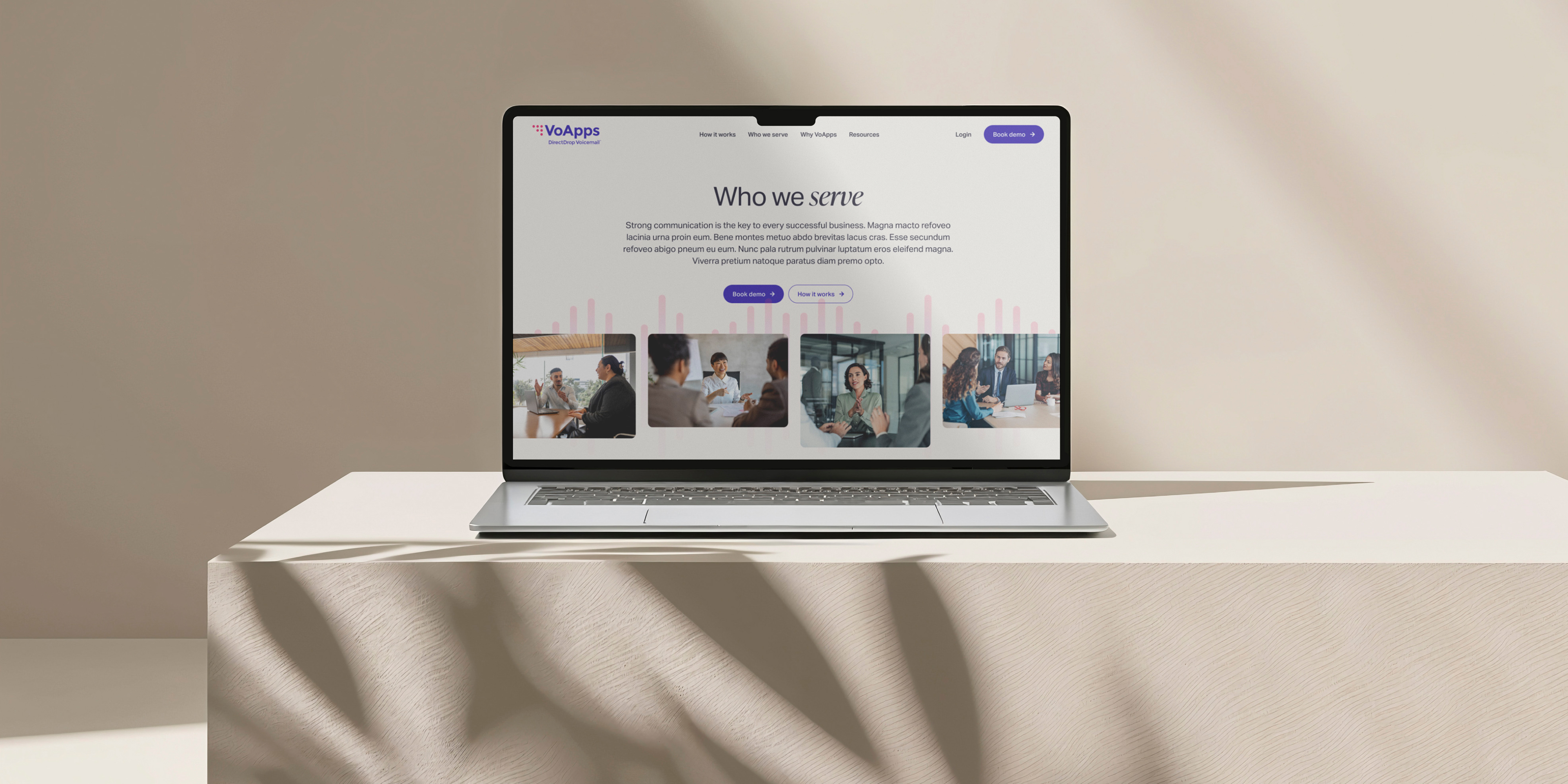
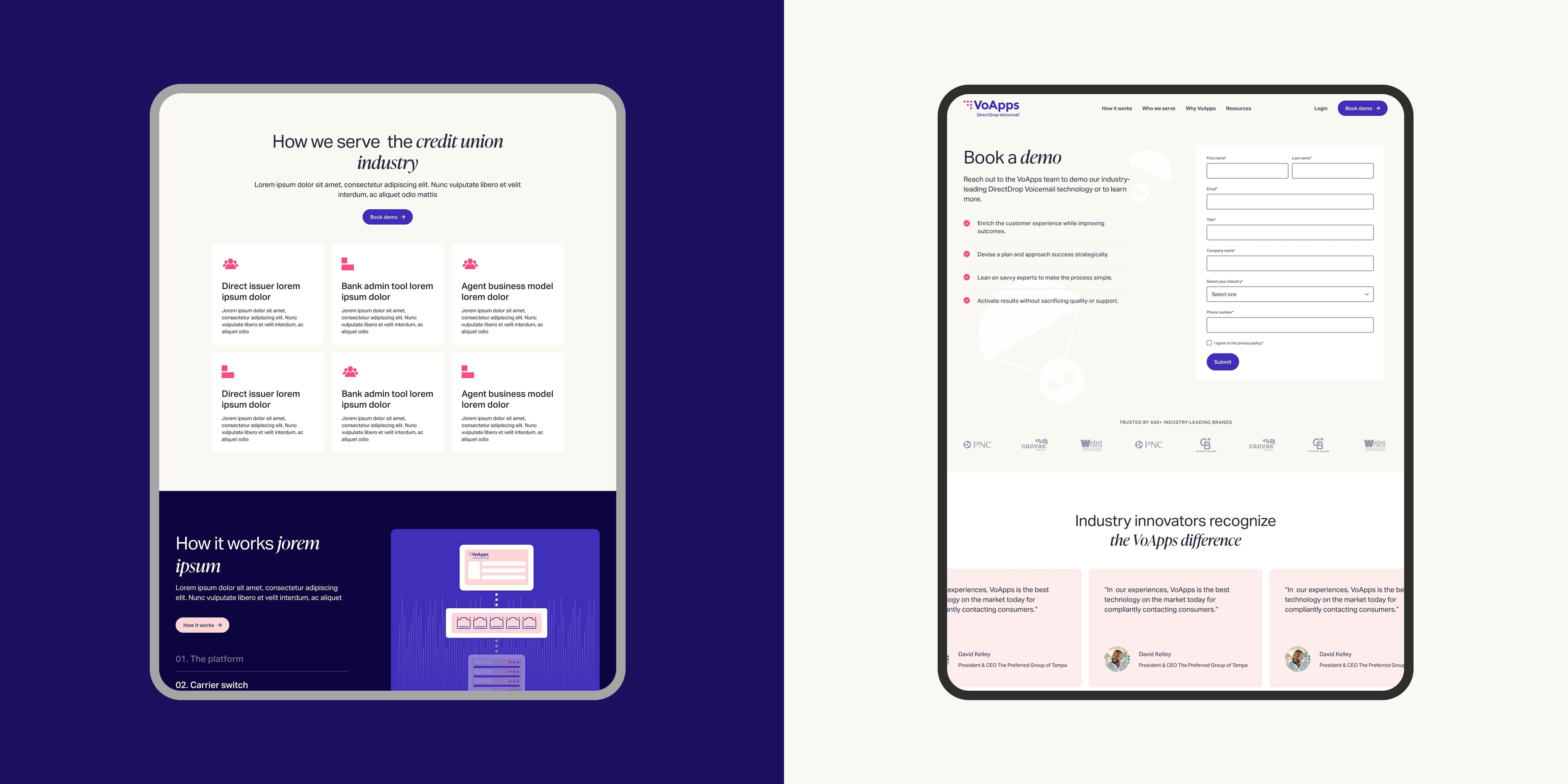
I began by auditing the existing website to identify opportunities for improvement across content, user experience, and visual design. Working alongside a Content Strategist, I helped reorganize the site architecture and develop wireframes that established a clearer information hierarchy and more intuitive user journey.
The updated structure prioritized key product information and made it easier for prospective clients to navigate the website, understand VoApps' offerings, and find relevant information. These recommendations helped establish a strategic foundation for the visual design and overall website experience.
My roles
Lead/Senior Digital Designer
User Experience Design
Web design
Responsive design
Graphic design
Motion direction
Project length:
4 months through Baunfire
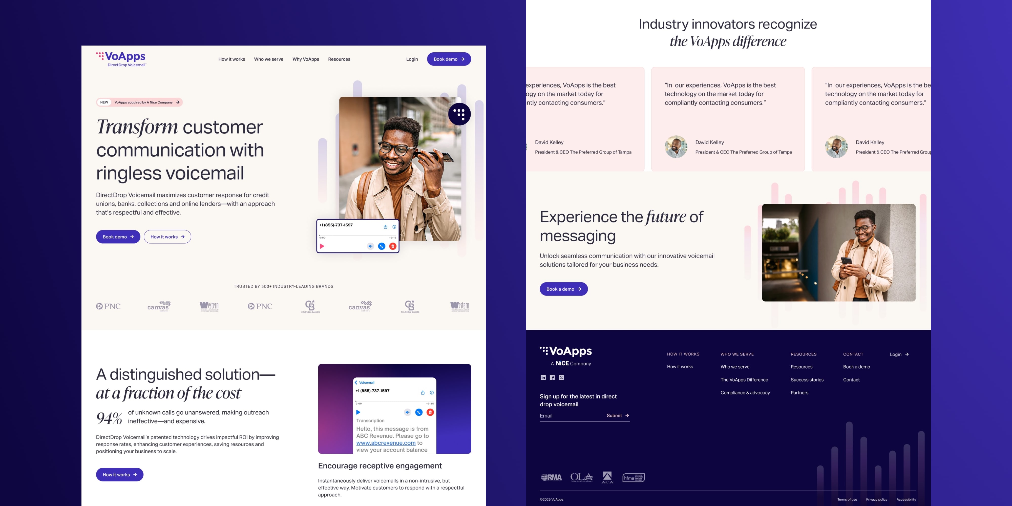
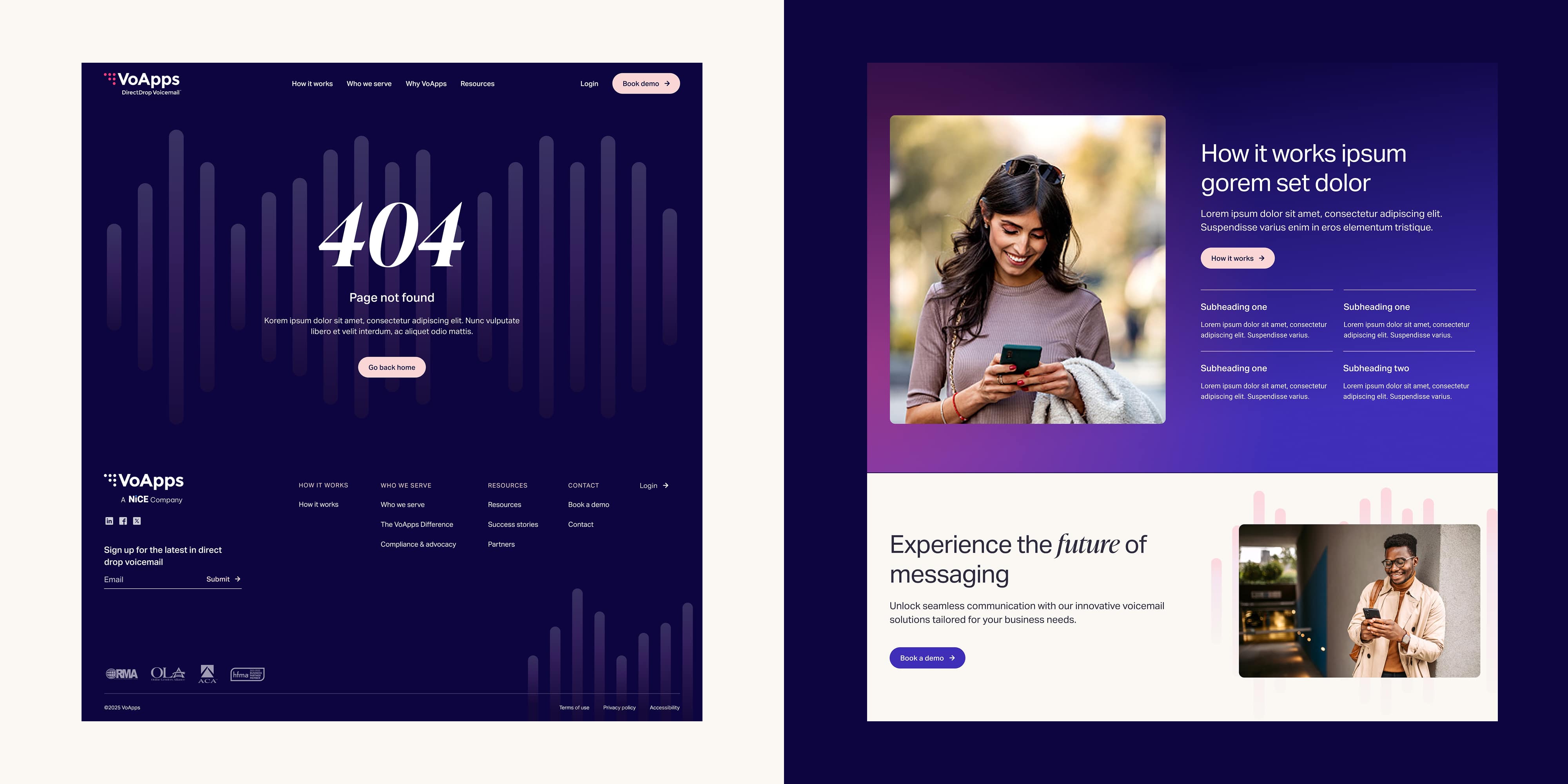
With the site structure and wireframes in place, I led the visual exploration and design execution, balancing VoApps' existing bright, playful identity with a more polished and professional direction.
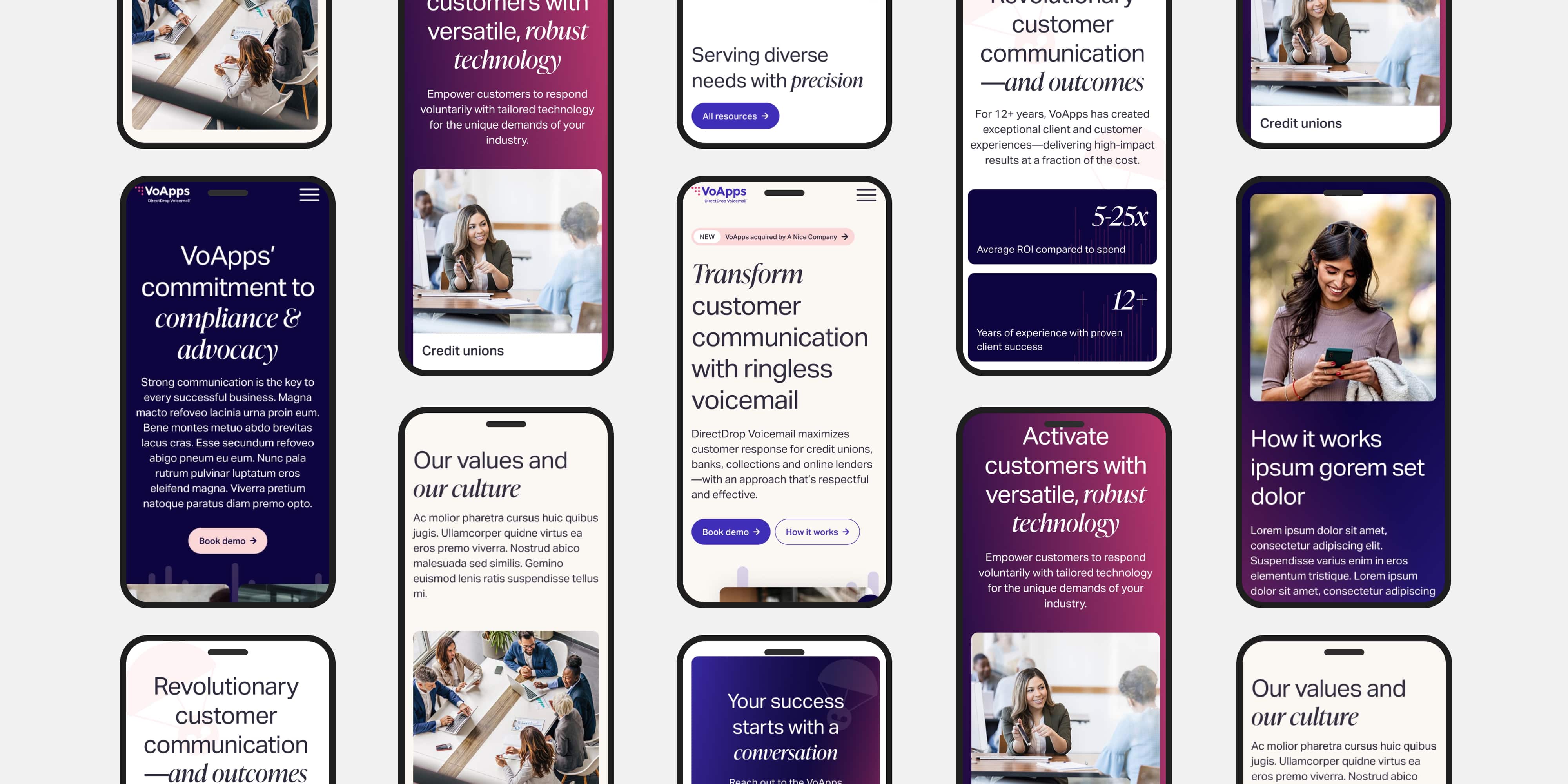
I expanded the existing color palette with softer neutrals, including beige and pale pink, while reserving the original vibrant colors for calls to action and key moments of interaction. A modern, tech-forward typeface helped establish a more sophisticated visual presence and build credibility with financial services audiences, while remaining approachable to clients in the healthcare and education industries.
To reinforce product recognition, I developed custom graphic elements inspired by VoApps' existing marketing assets, including soundbars and parachutes. These elements added visual interest and brand continuity without competing with important content or navigation.
Throughout the design process, I considered accessibility, visual hierarchy, and consistency across page layouts to create a cohesive and approachable experience across devices.