My roles
Senior designer
Branding design
Logo design
Graphic design
Project length:
1 month through Baunfire
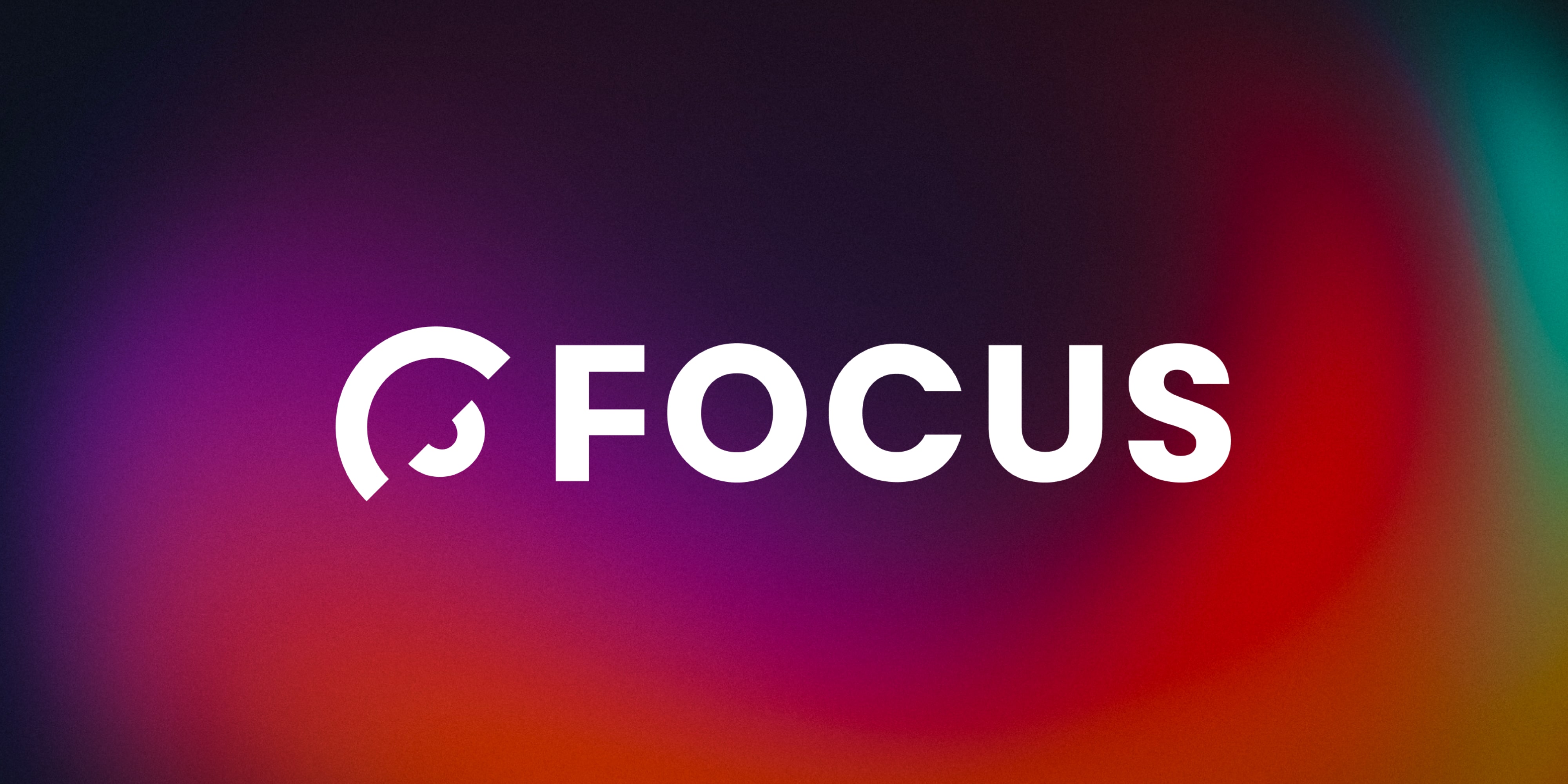
As Lead Designer, I interpreted the theme of “Focus” through the lens of photography—literally and conceptually. The logo centers on a lens-inspired motif, with semi-circular shapes forming a subtle aperture around bold, all-caps type. This concept visually reinforces Redis’s ability to zoom in on what matters: their product, their people, and their clients.
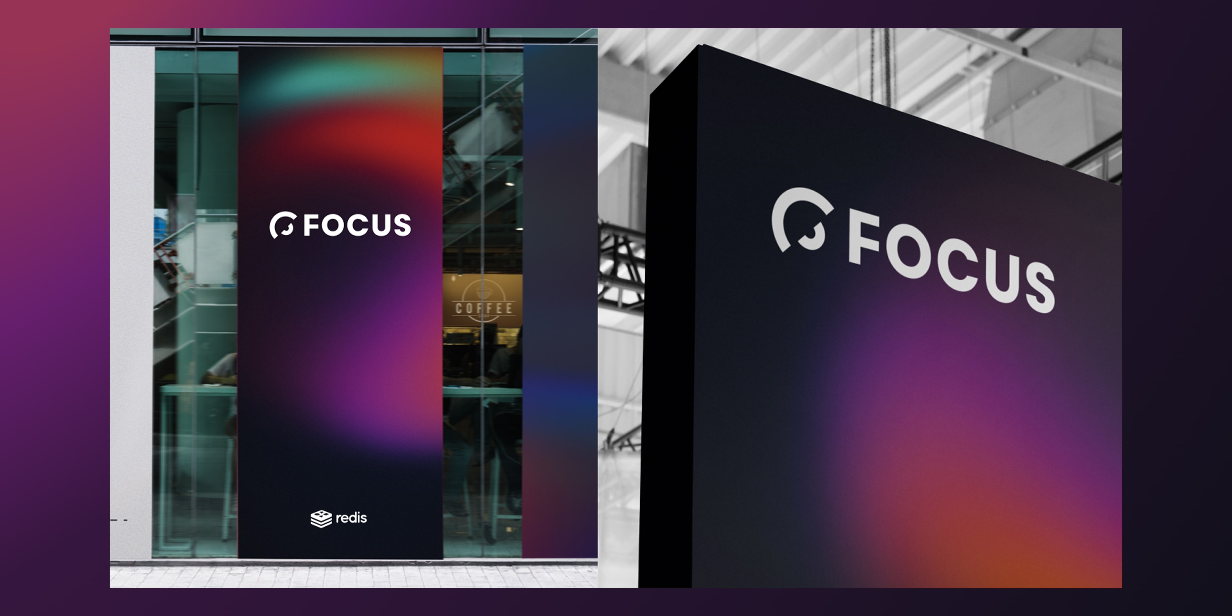
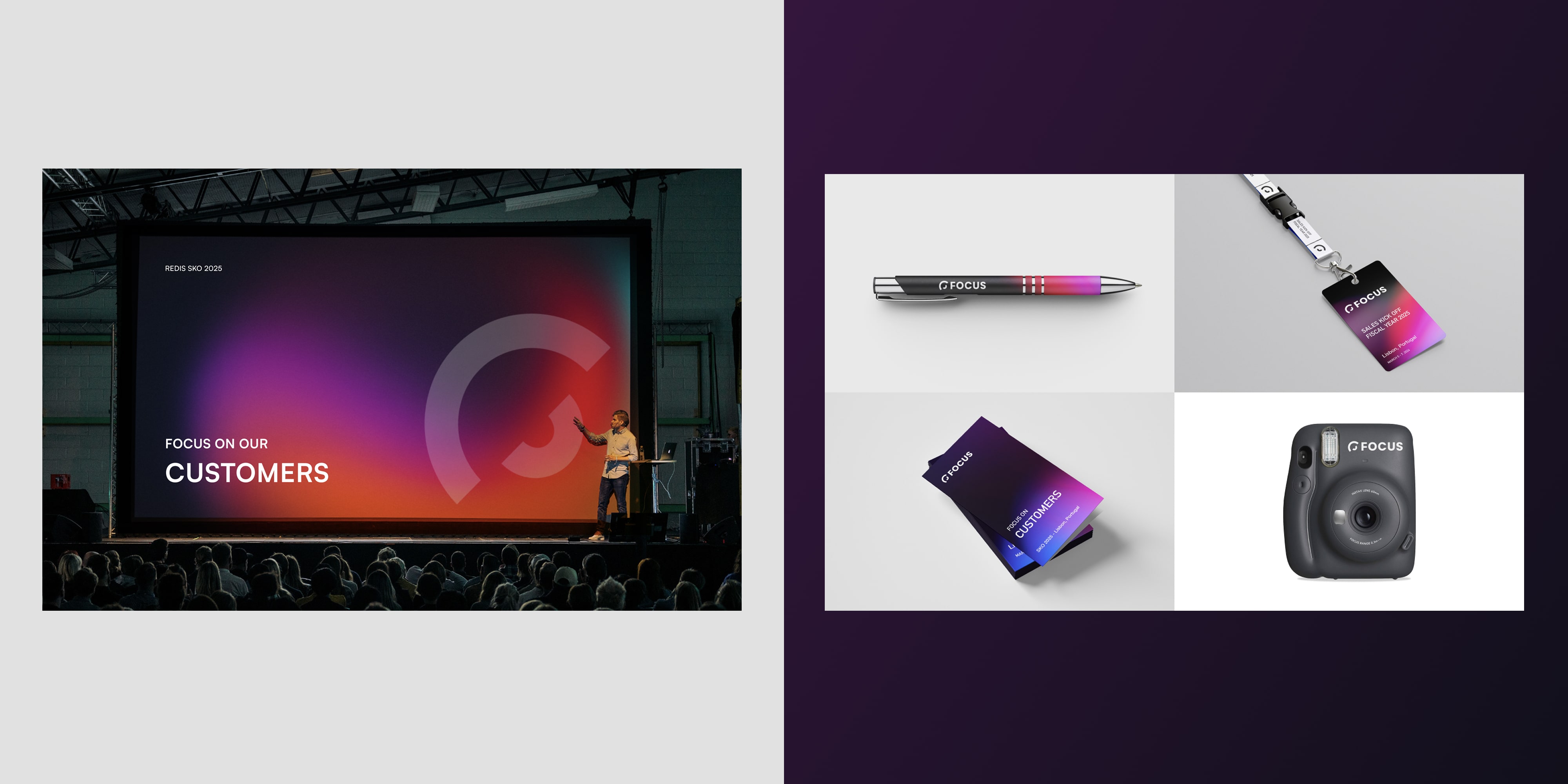
To expand the brand system, I leaned into the dynamic interplay of light and color that often reflects off a camera lens. Using dark, immersive backgrounds paired with bright RGB-inspired gradients, the brand feels cinematic, energetic, and alive. This contrast helped bring a sense of depth and dimension to the SKO experience, both on screen and in physical collateral.
The type system is clean and modern—tech-forward without sacrificing clarity—supporting Redis’s identity as an innovative, high-performance company. The final brand package included the primary logo, a visual language for presentation decks, digital signage, and environmental design assets. The result is a vibrant, unified identity that amplifies Redis’s message of focus and momentum heading into the year.